A platform for K12 students to learn flexibly and effectively
Snapask is an education technology company that applies machine learning and mobile cloud services to make education more effective, personalised, and accessible to everyone..
In APAC, Snapask supports 4+ million students across 11 regions in their post-secondary studies, aspiring to be the largest and best online self-learning service for students.
Challenges
In 2020, due to the pandemic and the service extension, we changed our main offering from online tutoring to on-demand courses and regular live classes for secondary students for their after-school studies.
In light of the increasing user needs and features in 2021, it is imperative to provide search functions for users to have a simpler and more effective method to find the relevant information they are interested in. Therefore, we decided to launch the new search feature.

Tiers with student types
Scope
From competitor analysis to prototype and development, user experience has been the focus of all the phases in the design process.
The product design team defined the display logic and set the appearances of the search engine through elaborate user research and detailed consultation with data engineers.
Research
Design
Data
Main phases in this project
・Understand the internal needs
・Clarify user needs through questionnaire
・Discuss the structure of data with the product owner and the data engineer
・Execute competitor analysis
・Share the discovery with internals members
・Consolidate the needs and efforts
・Define product goal for V.1
Build experiences
Run user testing and adjust the design mockup
Launch V1.0
After 3 months, analyze the patterns
Participants
Product Owner
Raymond Huang
Researcher
Ben Tseng
Sonia Wu
Lead Product Design
Alice Wu
Content Designer
Vera Liu
Software Engineer Lead
Joe Wang
Data Engineer
Allen Chang
Android Developer
Brank Hsu
Sr. iOS Developer
Han Chen
Web Developer
Anna Lu
Expected outcome
Snapask first launched its online tutoring services in 2015. The quiz feature was later presented in 2018. In 2020, courses and real-time class streaming services were officially introduced.

Business
User
・Suitable tools
・New concepts
Through the discovery and discussions with researchers, we concluded that the user journey of the search term consisted of clicking search, inputting text, and checking the search results.
Launch product
Click search
Input text
Check result
Check history
Edit history
Competitor Analysis
Based on the journey, we defined 3 main components to focus on
Click here to see the complete research results or scroll down to read the summary.
To be more precise, we conducted competitor analysis to observe common strategies.

Position of the Search feature

Search Keyword Input

Search Results
Component 1: Position
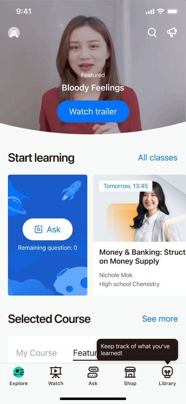
After assessing the different motivation of users, the search engine is equipped with 3 unique features:
・Magnifier icon
・Search bar at the top of the page
・Bottom tab for search
Users would be able to access the search function on every page in any form
Magnifier icon
With the magnifier icon, users would be able to understand its purpose and expect the next step after clicking on it at first glance.

Magnifier icon at the top right corner of the page
Search bar at the top of the page
Users have a clear intention to search for a place, a restaurant or a dish on some products, such as GoogleMap, Uber and Zomato. With a search bar, users can search for the intended targets directly with a single step.
A search bar can help users with strong motivation find what they want intuitively.
Search bar at the top of the page
Bottom tab for search
Placing a tab at the bottom of the screen is a common design for apps of media, delivery services and social media. Users of these apps are often unsure about where the tab is going to lead them. With the search icon added to the bottom tab, users can be easily guided and find customised recommendations that catch their eyes.
The main idea of adding a search feature to the bottom tab is that the platform would be able to offer personalised suggestions for users to explore among thousands of items.
A bottom tab for search
Action items
In light of these concerns and observations, we decided to place the search feature at the top right corner and provide popular search terms on the search page for users who need more guidance
The reason why we situated the icon at the top right corner is that students of Snapask not just search for a specific concept immediately upon launching the app, but also tend to browse the app and read the articles listed on the homepage such as “how to prepare for examinations”.
Moreover, to fulfill different learning types of learners, we also provide popular search for students who need more guidance helps them explore.
· Place the search icon at the top right corner
· Display the search icon on each page
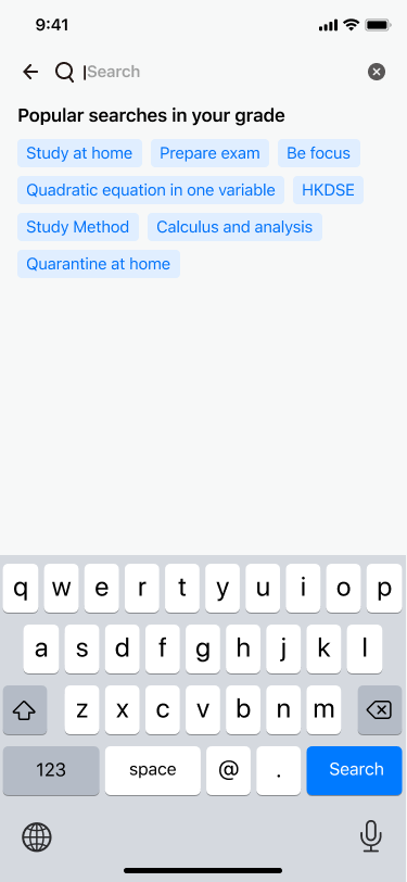
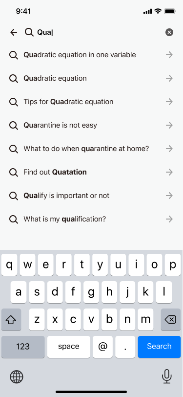
Component 2: Input
Users can easily refine and optimise their search with system recommendations while inputting search targets
The 2 following sections focus on the pattern and style:
・Scoping
・Style
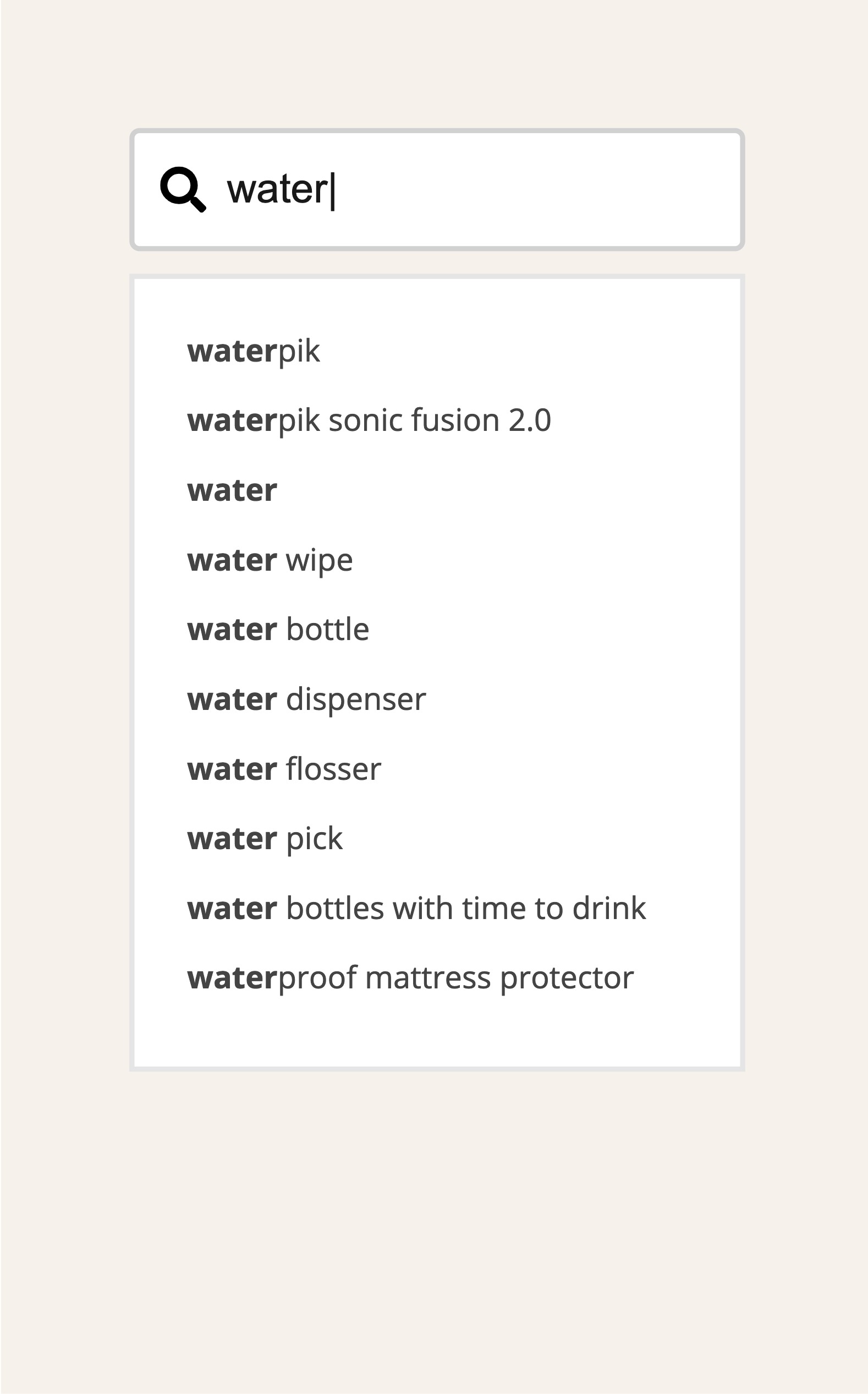
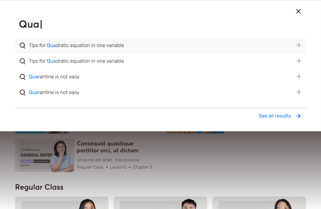
After conducting thorough product comparison, we set the search system to provide suggestions after the 2nd/3rd chars input and only present under 10 suggestions.
Scoping
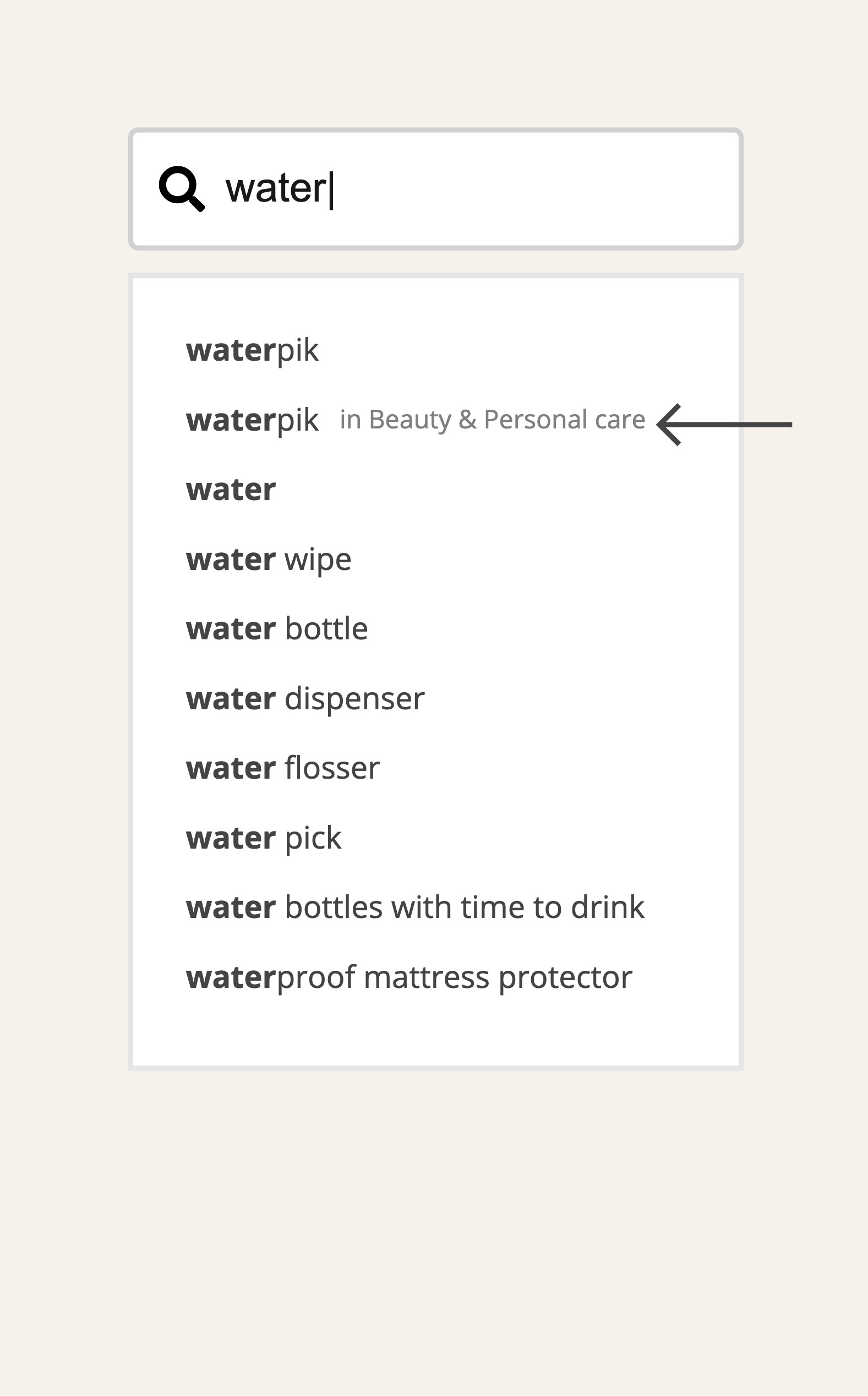
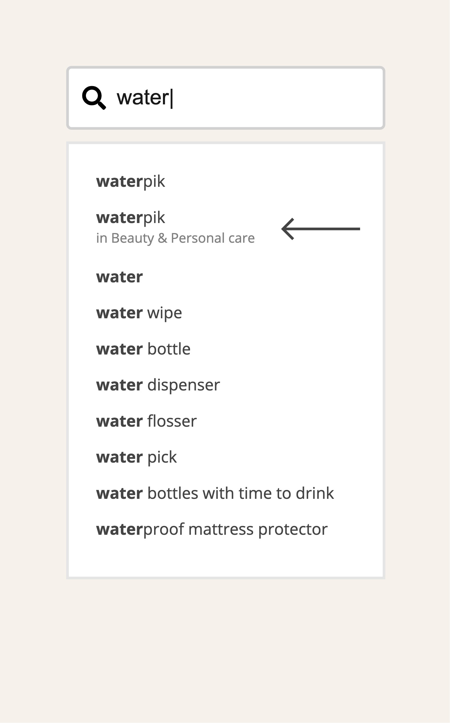
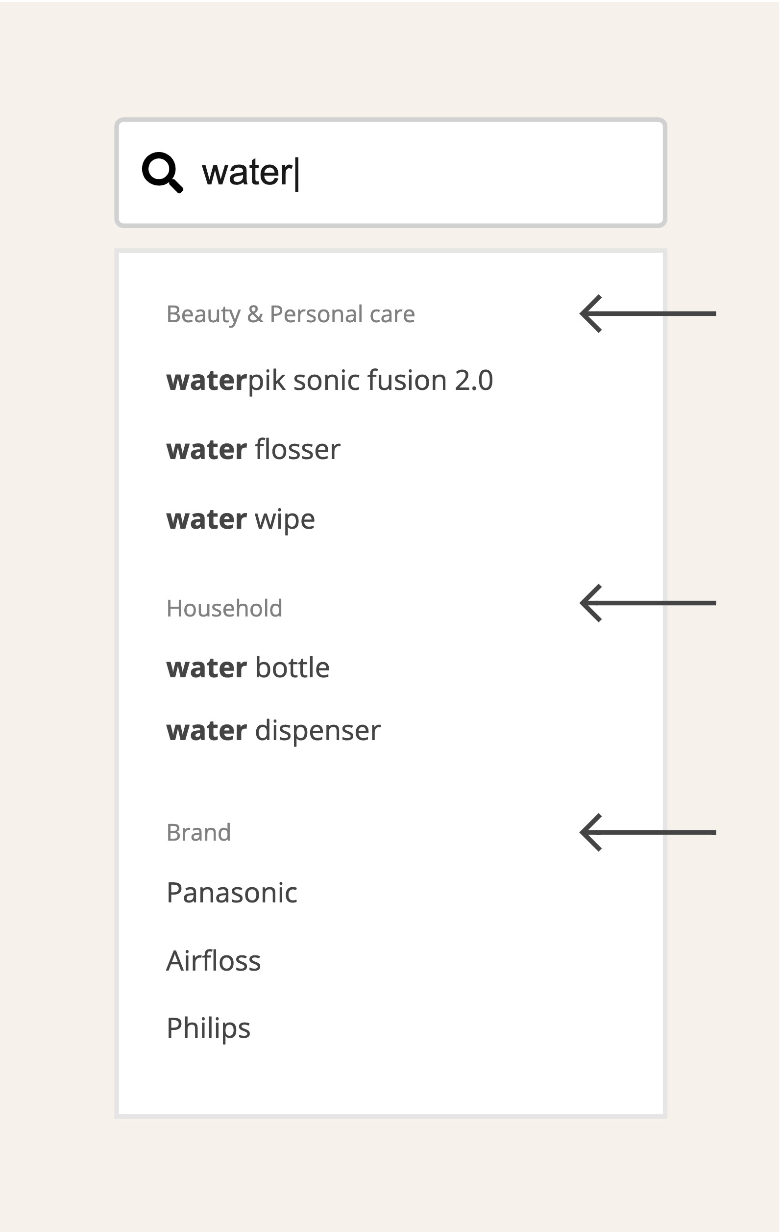
4 common display methods to demonstrate the category of the target item and what other results can be found through the it
01
No categories
02
Category scope next to the query terms
03
Category scope beneath the query terms
04
Category scope above the query terms
Style
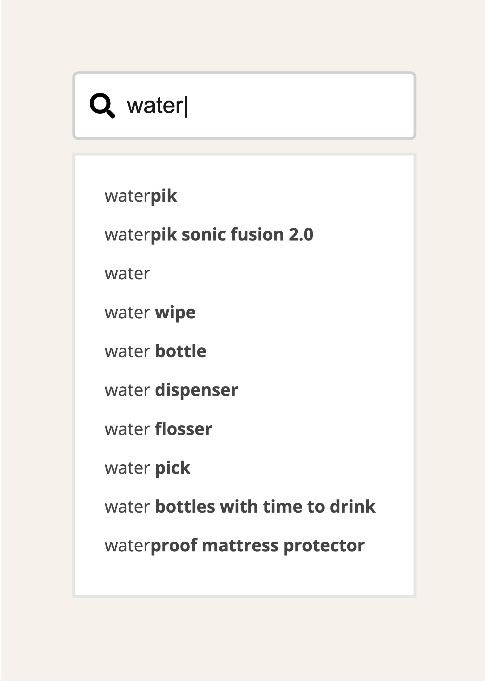
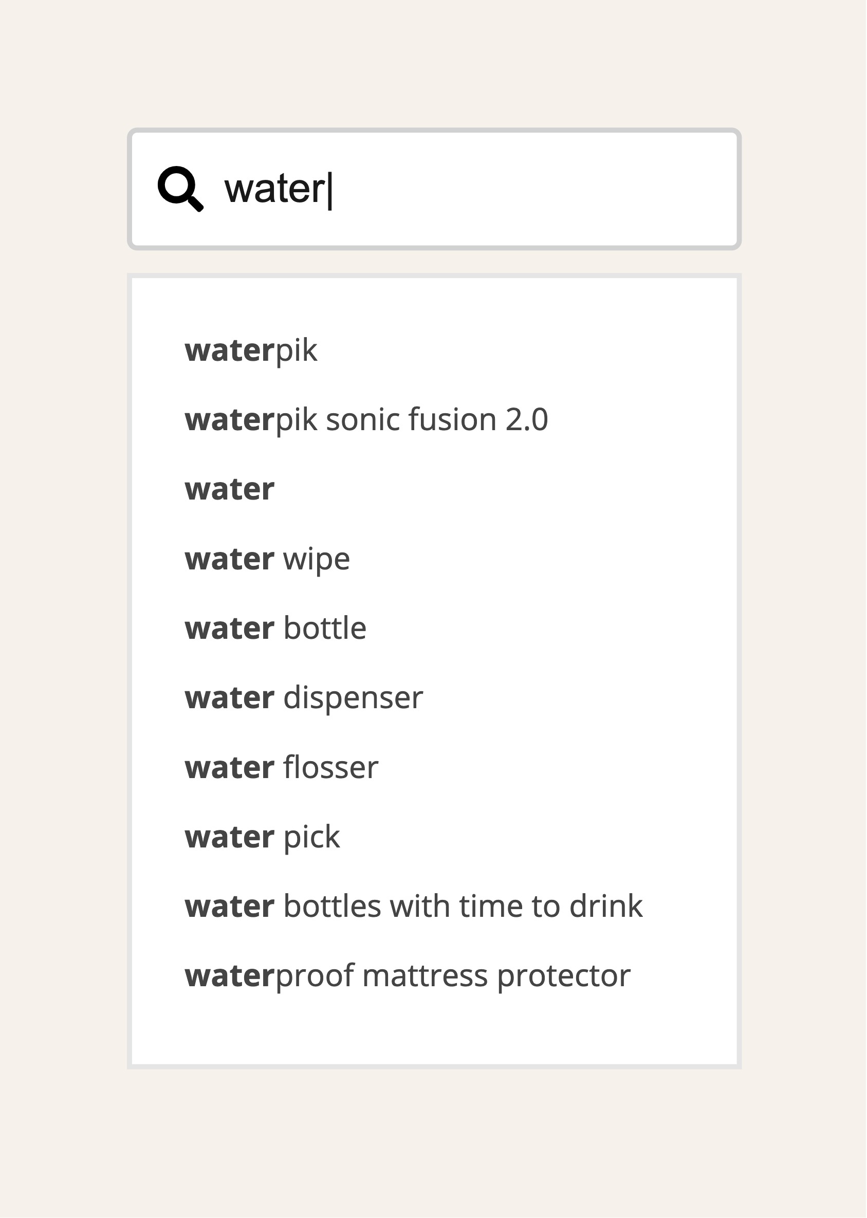
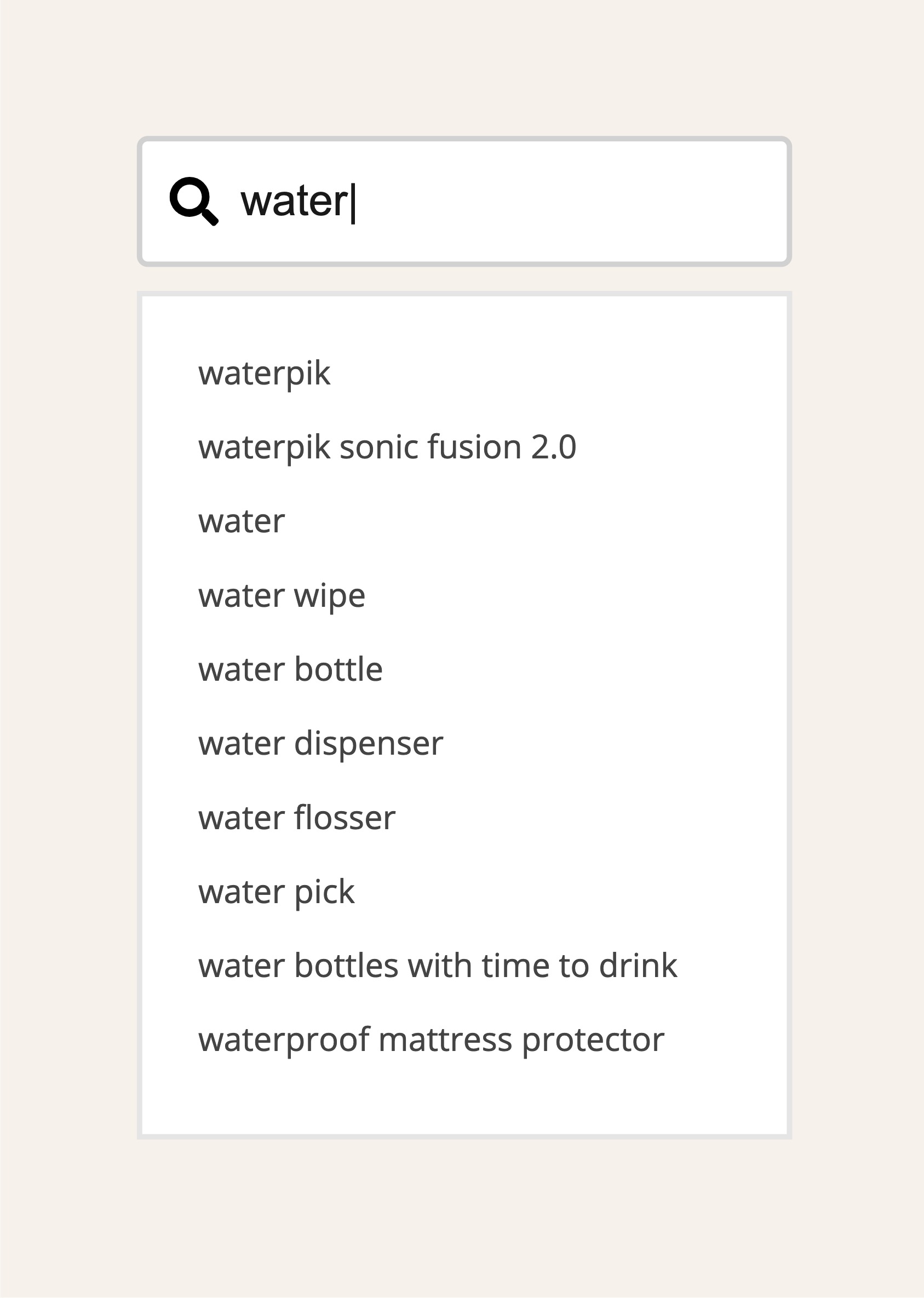
While inputting search terms, there are 3 main display styles to highlight and distinguish the difference between input text and suggestion text.
01
Texts turn normal during input:
Users would focus more on the system suggestions
02
Texts turn bold during input:
Users would focus more on the input text
03
No changes during input:
Users would read into the whole suggestion list
Action items
After thorough evaluation, we settled on the 2nd design, which would not affect user behaviour. However, we have yet to acquire enough items and categories for users to search for. As a result, we would not categorise the items in this phase.
Moreover, limiting the number of suggestions to less than 10 makes it easier for users to find the suitable option.
· Suggestions are provided while inputting 2 chars for all regions
・No categories in this phase
· Under 10 suggestions
· Texts turn bold during input
Component 3: Results
With different result views, we are able to affect user behaviours. Providing features of autocorrection and recent search history would give users a sense of security.
The following 3 sections focus on the pattern and style:
・List view, or grid view
・Correct spelling
・Keep recent search result
List view, or grid view
Search mode
· List view displays complete content and allows users to receive more information without swiping left and right.
· List view is easier to read, and allows users to make decisions more efficiently.
Browse mode
· Grid view allows more space for users to explore.
· Users can swipe the screen randomly with grid mode, which encourages browsing.
· Enlarged images and titles make it easier to attract users effectively.
List view
Grid view
Correct Spelling
Provides relevant results even when target search terms are misspelt.
Recent Search History
Keeps search history for users to look back while the option of clearing the history is provided.
Action items
We considered mixing the grid view and the list view in the product, and set the listview on top, so users can read the most relevant information thoroughly.
In addition, we provided search history for users to look back and allowed users to exercise the option of clearing search results.
Moreover, after considering the cost of human resources and its relevance to the goal, we decided against implementing the autocorrect feature into the product in this phase.
List view with grid view
· In the first section, correlated courses are displayed with list view for users to search thoroughly
· Grid view will display extend courses or classes in the next section
.Support recent search records for users to clear and look backOther
Other
Mobile v.s Desktop
On desktop web, there is more space to display information and expand search functions as compared to mobile.
Showing the result amount
Display the amounts of results to show users how much information can be explored.
Log in status
Support non-login users. Features are provided depending on the product focus and strategies.
Prove the concept
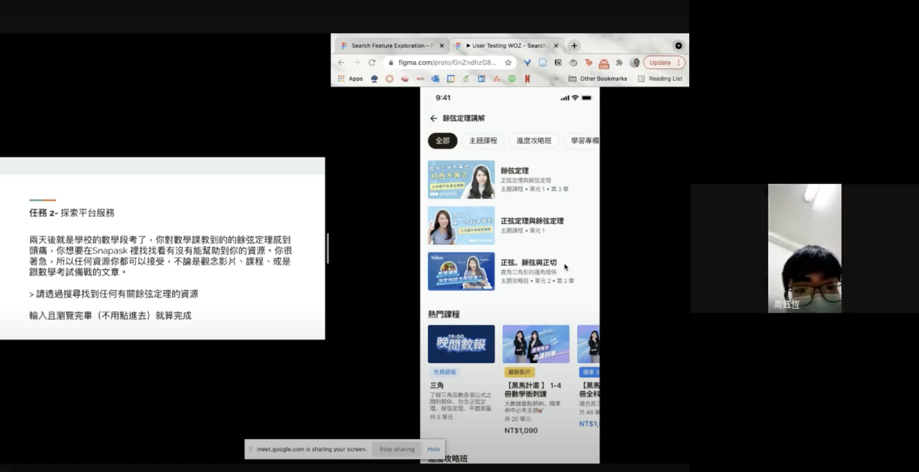
To see the details, we built a prototype and conducted user testing to determine if there is anything that can be improved in this phase
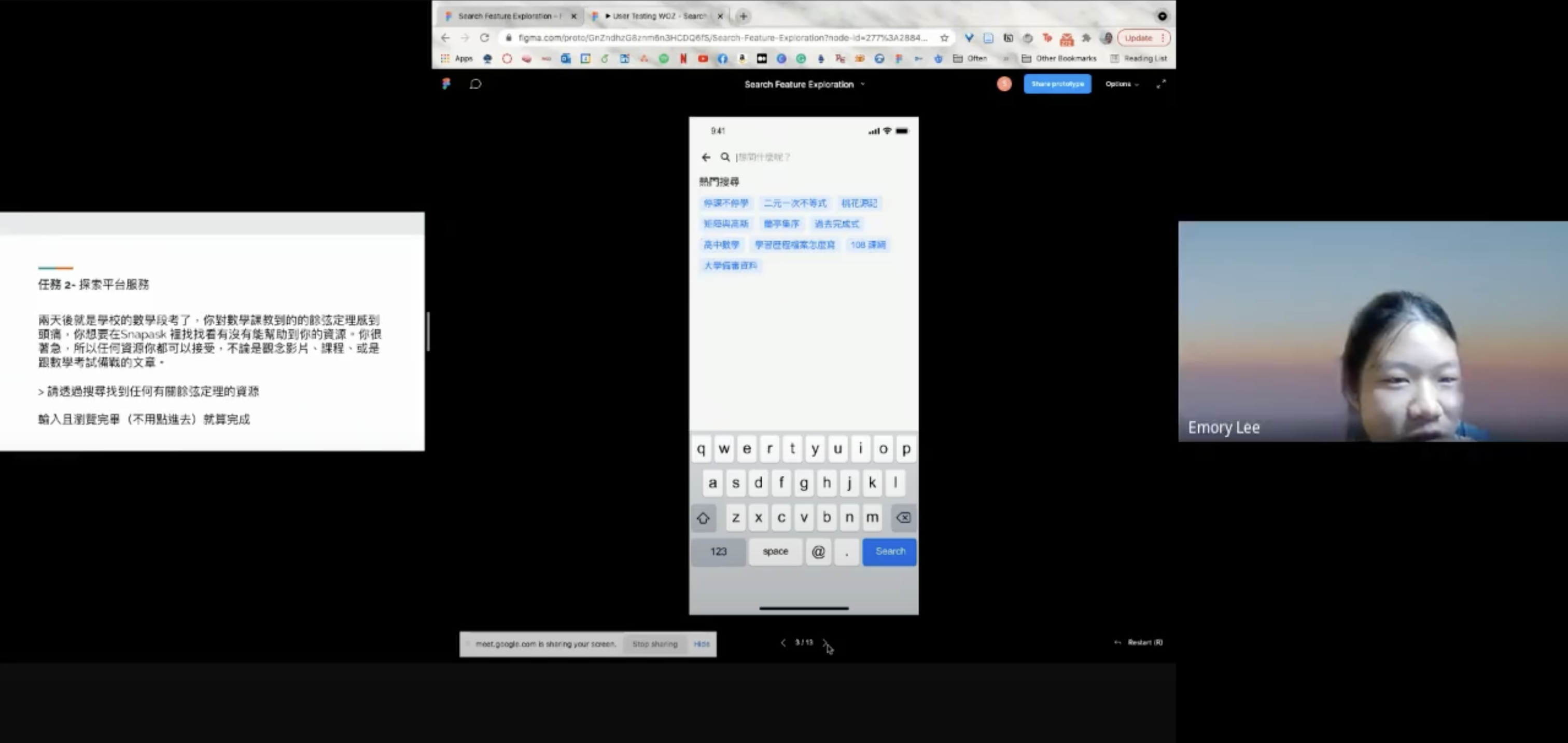
User Testing ReportWe conducted a 60 minutes moderated user testing in Taiwan remotely. This study was composed by a 45 minutes Wizard of Oz user testing (with Figma prototype + google meet), and a 15 minutes user interview about their remote-learning experience.
Participants: 1 junior-high and 3 high-school students (2 non-users, 2 paid users)
5 Tasks for testers to complete
Task 1
Input keywords
Task 2
Browse suggestions
Task 3
Browse ways to learn
Task4
Search specific concepts
Task 5
Use auto-completion
4 Questions we expected to be answered by the users
Obstacles
What are some of the usability issues of our current search feature?
Expectation
Is there more information students expect to find in search but we have yet to provide?
UI appearance
Do students prefer list-view search results when they are searching for specific concepts?
UI appearance
Do students prefer grid-view search results when they are browsing contents with Search feature?
User testing through Google Meet
Appearance on App
Based on the results of the user testing, the aspects of the design were adapted in order to make the information more suitable for presenting in this phase.
Position
Place the search icon at the top right corner and it would be displayed in every navigation bar, which makes it easier for users to access Snapask Search Suggestion
Input
Following the research results and estimation, users can see the suggestions by inputting the 2nd text, texts that users typed will turn into bold so can more comfortable to distinct the differences, and will show in 10 suggestions
Result
A mix of list view and grid view would be available and with listview being upfront allowing users more information at the beginning.
The results would be displayed in detail based on the user grade levels.
Due to the limited engineering resources, we deprioritized the hierarchy of the autocorrect feature in this phase and let users submit their desired search targets.
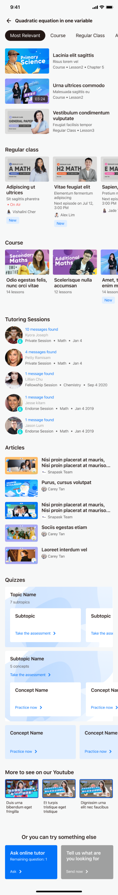
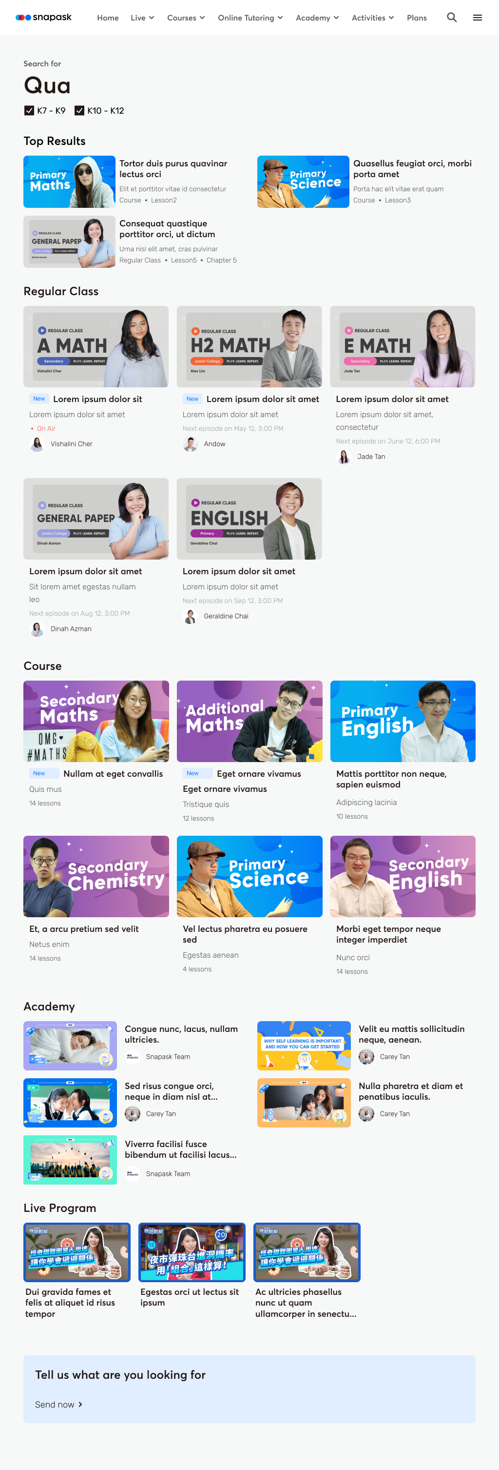
Section 1: Most relevant video content
If a user inputs a keyword that maps to a course or class, the most relevant courses or lesson content would show up for users to explore. Moreover, the length of the videos would be shown to help users estimate the time needed.
Section 2 and 3: Course and Regular Class
Grid view is designed to allow broader visions of related content based on the inputs. Classes uploaded within 30 days would be tagged as “New” to inform the users that these classes are recent.
Section 4: Online tutoring
Users can also search for the sessions they have asked questions in through the search feature and review the homework done in these sessions.
Section 5: Articles
Academic articles are available for users to study. With the design of list view, users would be encouraged to read more.
Section 6: Quizzes
With search, students can find which concept they would like to practice in their daily study.
Section 7: More program to study
Bite-sized videos are regularly uploaded on our YouTube channel. Students would be able to learn passively with this free content during their daily routines such as commuting.
Section 8: Meet questions
Students can send questions they have directly through the “Ask Question” entrance button, or submit what they want to search for.
Appearance on Web
Most of the structures are the same as the app with the exception that guest users can search the items they desire on the web.
Position
Similar to the design on our app, we placed the search icon at the top right side of the navigation bar, and it would be displayed on every page for logged in users and guests.
Input
Following the app experience, users would receive suggestions upon typing out the second text. The input text would turn bold so that the user can clearly distinguish the difference, and there would be 10 suggestions at most.
Result
In contrast to the app, guest users are also allowed to experience the search function. The reason is that the usage scenarios on the 2 platforms are different. Thus, the users of the web page can select filters for their preferred curriculums.
Go to market
At the start of Jan 2022, the product was launched for 3 months. Through Amplitude we can see that around 30% of our users are able to find the intended information after receiving the search results. However, we still do not have enough items for our users to explore, which still causes a huge dropout rate.